Charts and widgets
Charts are built on a panel's Graphs tab, from its own columns. Anything you build there can be resized, opened full screen, exported, or pinned to the dashboard.
The chart types
| Type | Best for | Works well on |
|---|---|---|
| Text | A single number, large: the headline figure | Any column with an aggregation: count of rows, sum of value |
| Bar | Comparing categories against each other | Status, Category, Dropdown, Owner |
| Line | Change over time | Date and Date Time columns |
| Pie | Parts of a whole, few categories | Status, source, channel |
| Doughnut | The same, with room for a total in the middle | Status, owner distribution |
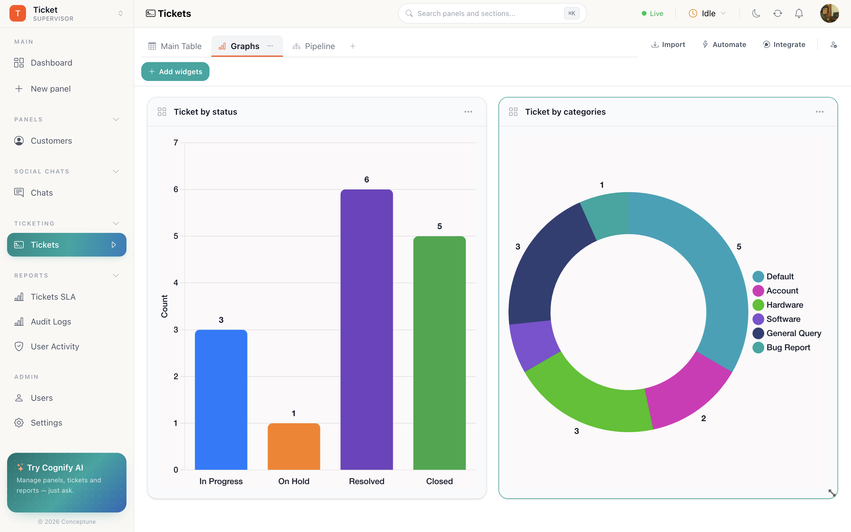
Building one
- Open the panel → the Graphs tab. Add one with the + on the tab strip if it does not exist yet.
- Add widgets.
- Choose the column to chart.
- Choose the chart type.
- Resize it on the grid, and open its Settings to adjust.
Choosing the right one
Charts follow the data
A widget reads the panel it lives on, so it respects that panel's sections and reflects changes as they happen. A chart on a Ticketing panel's Open section shows open tickets; the same chart on Archive shows the archive.
It also respects permissions. Someone with Must view only its own Panel Data sees charts built from their own rows, not the team's.
Widget actions
| Action | Where |
|---|---|
| Resize | Drag the widget's corner on the grid |
| Full screen | Widget menu (⋯) |
| Settings | Widget menu: chart type, column, and the controls below |
| Export | Settings → Export. Queues the underlying numbers as a background task |
| Pin to Dashboard | Settings → Pin to Dashboard |
| Delete | Widget menu. Removes it from the Graphs tab |
Aggregations vs charts
Not everything needs a chart. A column aggregation puts a total in the table footer with no widget at all, often the faster answer for “what is the sum of this column right now”. Reach for a chart when you want the shape of the data, not just its total.
How do I…
Chart a column: Add a Graphs tab → Add widgets → pick the column and the chart type.
Show one big number: Build a text widget and give it the aggregation you want.
Put a chart on the dashboard: Widget Settings → Pin to Dashboard.
Get the numbers behind a chart: Widget Settings → Export, then collect it from Background tasks.